The gentle, pastel shades
People who decorate their homes with prevailing gentle pastel shades of blue, green, and peach often have a deep affinity for nature. These colors evoke images of a clear sky or expansive fields, infusing a sense of tranquility into their living spaces. Their subdued intensity offers a calming effect and is especially gentle on the eyes.
If your interior is predominantly adorned with green and its related shades, your home can become an oasis of serenity in our bustling world. To infuse more vibrancy and energy into your space, consider combining these soothing pastel tones with accents of yellow, orange, or brown through your choice of furniture and decor details. This blending of hues can create a harmonious balance, adding both warmth and vitality to your home.
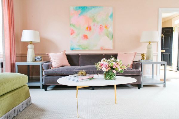
Image credit
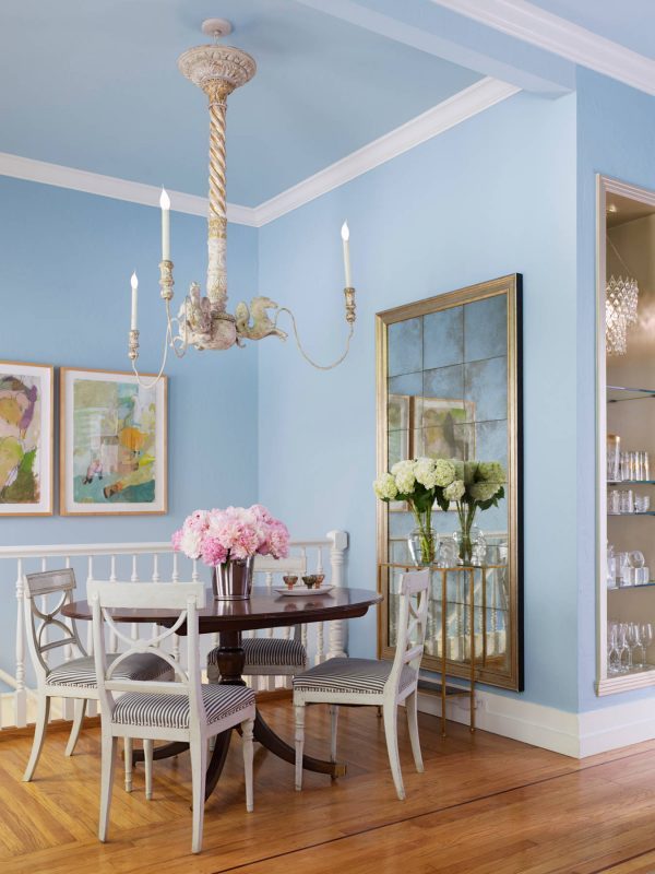
Image credit
Bright and warm tones of yellow
Yellow, orange, and peach colors radiate brightness and evoke feelings of sunshine and fire. These warm and vibrant shades infuse energy into your interior, creating a cozier and more inviting atmosphere that can stimulate conversations and appetites. On the other hand, cooler colors have a visually expansive effect.
To strike a balance and regulate the “temperature” of your home, consider blending yellow tones with cooler hues like blue-gray and various shades of green. Additionally, pairing orange with black can create a dynamic contrast that adds depth and visual interest to your space.
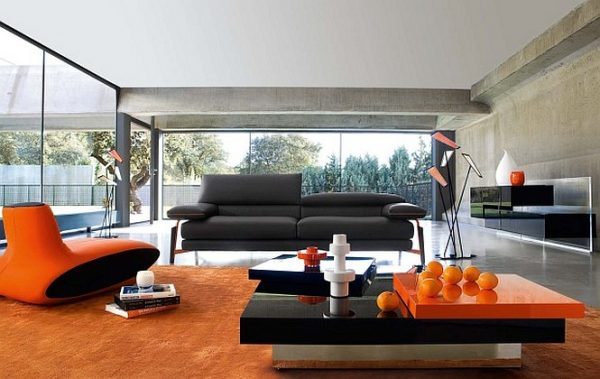
Image credit
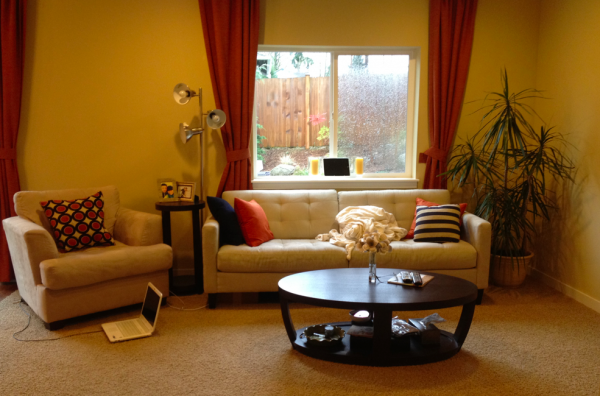
Image credit
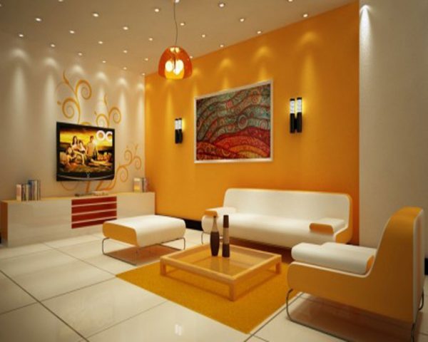
Image credit
The elegant colors of gemstones
Individuals who adorn their homes with shades reminiscent of ruby, sapphire, amethyst, and topaz often have a penchant for opulence and luxury. The allure of precious gemstone colors lends an air of grandeur and comfort to their interiors, effectively camouflaging imperfections. These rich hues are particularly well-suited for spaces where extended periods of time may not be spent, such as the dining room, hallway, or bathroom. Their transformative qualities can instantly elevate the ambiance, making these areas feel glamorous and inviting.
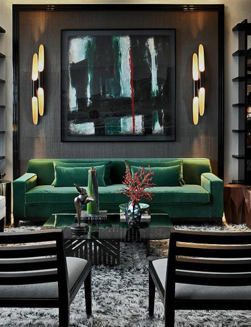
Image credit
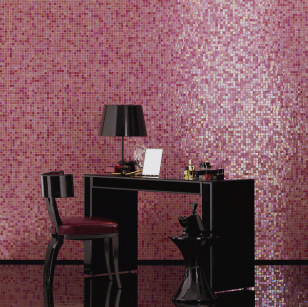
Image credit
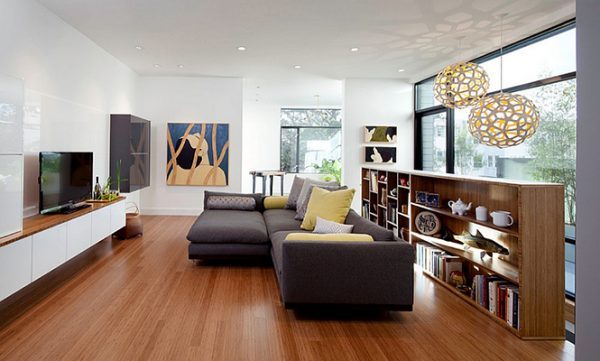
Neutral tones
Materials like granite and marble, characterized by subtle shades of gray, brown, beige, and ivory, have a unique ability to blend seamlessly while providing a versatile backdrop for more adventurous furniture color schemes. However, some may find these colors rather understated.
To breathe life into your living space, consider pairing soft fabrics with elements like wood, glass, and metal surfaces. Creating contrasts between colors and materials can prevent your home from appearing overly clinical and sterile. This interplay between textures and tones adds depth and character to your interior, infusing it with warmth and visual interest.
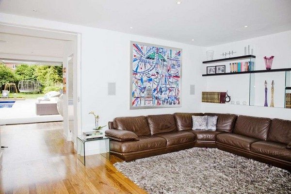
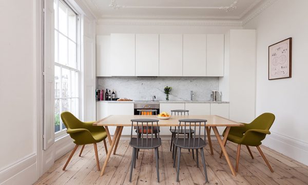
Image credit