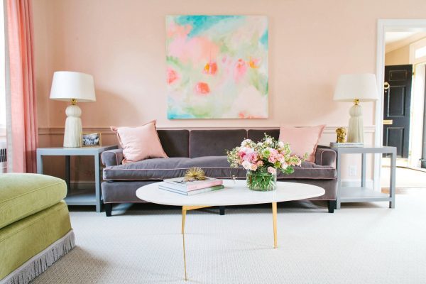
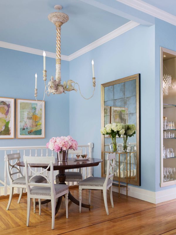
The gentle, pastel shades
People in whose homes prevailing gentle pastel shades of blue, green and peach love nature. These colors remind to a clear sky or a large field and bring peace in the home. Thanks to reduced intensity heat and brightness, better suited for the eyes. If your interior is dominated by green and it related shades, your home considers oasis of peace in a busy world. To enter more energy, combine pastel tones with yellow, orange or brown pieces of furniture and details.
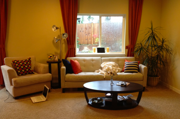
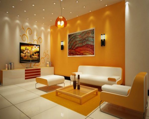
Bright and warm tones of yellow
Yellow, orange and peach colors are bright, evoke the sun and fire. Warm shades make the interior more energetic, more intimate, stimulating conversation and appetite, while colder colors visually expand. To lower the “temperature” in your home mix yellow tones with blue-gray and green shades, and orange with black.
The elegant colors of gemstones
Shades of ruby, sapphire, amethyst and topaz have people in their homes who prefer the grandeur and luxury. The splendor of precious stones is perfect for concealment of defects - the interior makes glamorous and comfortable. Use these colors in rooms where you do not spend too much time - in the dining room, hallway or bathroom.
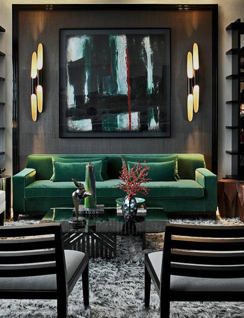
Image credit
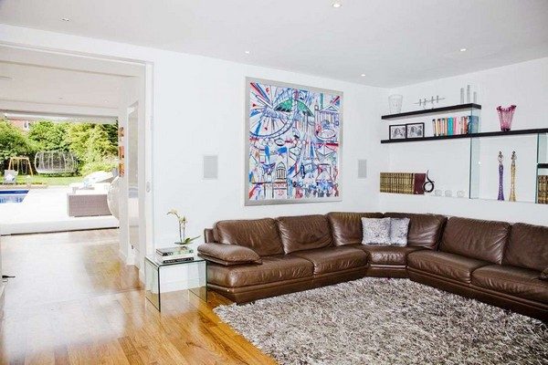
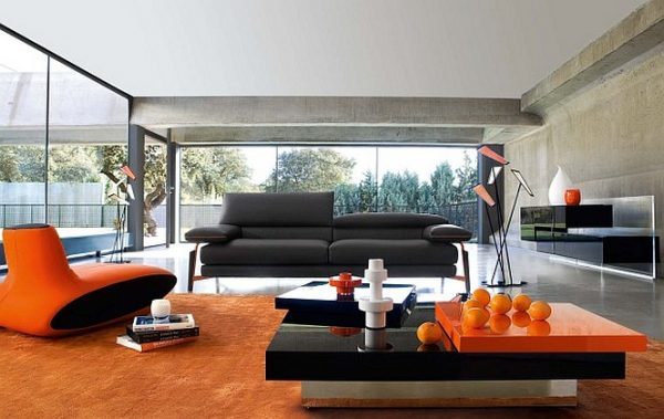
Neutral tones
Such as granite and marble, gray, brown, beige and ivory color act unobtrusively and at the same time allow braver color combinations of furniture. Some of us, however, considered boring colors. If you want to revive your home, pair soft fabric with wood, glass and metal surfaces. Make contrast between colors and materials so your living space to not look sterile and generally.